What this article covers
When people think about website design, they usually focus on colors, layouts, or images.
But one of the most powerful elements of your website’s personality is something much simpler: your fonts.
Typography quietly shapes how your brand feels. The right font combination can make your website feel refined, playful, editorial, modern, or timeless before someone even reads a single word.
And the wrong font choice? It can make a beautifully designed website feel cluttered, confusing, or unprofessional.
If you’re building a website for your business, choosing the right fonts is one of the easiest ways to elevate your brand presence.
Let’s walk through how to choose fonts for your website and a few of my favorite designer fonts that work beautifully for online brands.
Why Website Fonts Matter More Than You Think
Fonts do more than display words. They communicate tone, personality, and brand identity.
Think about the difference between these styles:
- A bold sans-serif feels modern and confident
- A soft serif feels elegant and editorial
- A handwritten script feels personal and expressive
Even if visitors don’t consciously notice your typography, it still shapes their perception of your brand.
Good typography can make your website feel polished and professional. Poor typography can make it feel chaotic or hard to read.
What Makes a Good Website Font?
When choosing fonts for a website, there are three things that matter most:
Readability
Your body text font should be easy to read across devices. Decorative fonts might look beautiful in headlines, but your main content should always prioritize clarity.
Personality
Your fonts should reflect the personality of your brand.
For example:
- creative brands often use expressive serif fonts
- luxury brands lean toward elegant editorial typography
- modern brands often choose clean sans-serif fonts
The goal is to choose fonts that reinforce the feeling you want your brand to create.
Versatility
A good website font should work well across multiple contexts:
- headlines
- body text
- callouts
- buttons
Many designers pair two fonts together: one for headings and one for body text.
Where to Find Beautiful Website Fonts
There are plenty of places to find fonts online, but not all fonts are created with branding and design in mind.
Many free font libraries are filled with options that look inconsistent, outdated, or difficult to pair together.
That’s why I often recommend looking at fonts created specifically for designers and brand-focused businesses.
One of my favorite resources is Jen Wagner Co.
Designer Typography for Modern Brands
Jen Wagner creates beautifully crafted fonts that feel both modern and timeless.
Her font collections are designed with branding and website design in mind, which makes them especially useful for designers and business owners who want their websites to feel elevated and cohesive.
On her website, she describes them perfectly:
“Quality-crafted designer fonts. Swoon-worthy fonts you can fall in love with.”
And honestly, that description is pretty accurate.
These fonts have a thoughtful, editorial feel that works beautifully across websites, brand identities, and digital products.
Whether you’re a designer creating work for clients or a business owner designing your own website, her fonts are created to feel like a natural fit.
Some of My Favorite Jen Wagner Fonts
If you’re exploring Jen Wagner’s font library, here are a few of our favorite styles that work particularly well for websites, especially if you’re loving the editorial vibes.
Editor’s Note
Jen Wagner’s Editor’s Note font has a stunningly crisp upper and lowercase typeface – perfect for any minimalist’s big headers or CTAs.
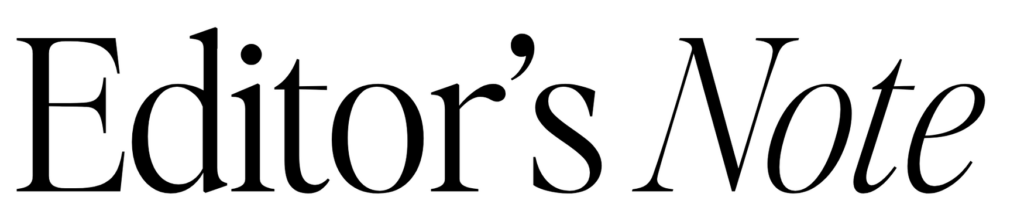
We’ve had a few clients go grab this font license for their website – it just looks incredible in large settings as a display text like those massive headers. Fans of big fonts over here.
Perfectly Nineties
We specifically have a client that loves all things 90’s and talks about flashbacks from the 1990s on their podcast, so we couldn’t let it pass that Perfectly Nineties by Jen Wager would be…yes…perfect for their website!
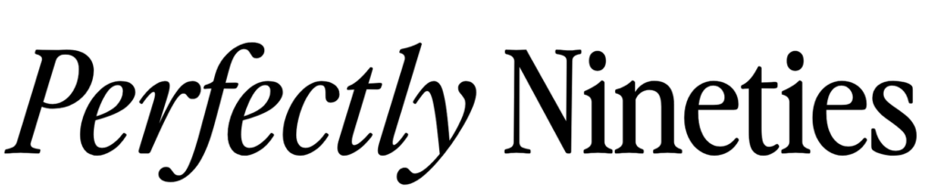
This is a nostalgic serif family font that looks incredible in both large and small settings. It’s classic, it’s tightly-spaced, and has some perfectly 90s magazine editorial vibes.
Carefree Serif
We told you we’re here for all the editorial vibes. This serif font makes it easy to elevate a headline whether you’re wanting something bold or delicate.
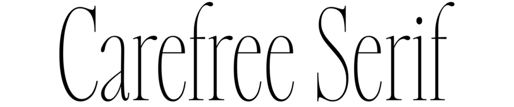
If you’re a fan of those huge header fonts on your website, this is an amazing fit. It has a nice balance for clean reading with its intentional spacing while getting those trendy vibes for you website fonts.
Sailing Club
Oh our Kennebunkport heart – we are not from the Northeast, but this is giving all the vibes of strolling the shops in the Hampton’s after a morning out on the sailboat.
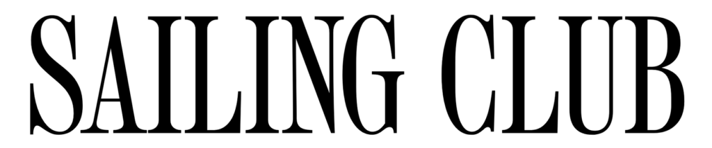
This one holds the power of subtle storytelling, bring a sense of sun-wrapped nostalgia wrapped in a casual but polished, Princess Diana fashion.
How Fonts Fit Into Your Overall Website Strategy
Fonts are just one piece of a larger website system.
For example, when designing websites we often think about:
- typography
- layout
- SEO structure
- lead capture
- client workflows
All of these pieces work together to support a business.
For example:
Your website design might be built on Showit, which allows complete design flexibility.
Your email list might be managed through Kit, helping you stay connected with your audience and you can design beautiful headers for your newsletter using your brand and website fonts.
Client onboarding and contracts might be handled through Dubsado and creating beautiful header images on your proposals and onboarding documents with your fonts is a continuation of your brand awareness.
And if you sell digital products, you might use ThriveCart to manage checkout and product delivery. Their checkout editor doesn’t allow uploading of fonts, but you can put header images or images throughout your checkout cart that has your beautiful fonts on them as well.
Each tool supports a different piece of the system, but it all starts with a website that communicates your brand clearly.
And typography plays a big role in that.
Choosing fonts for your website isn’t just a design decision.
It’s part of how your brand communicates with the people who visit your site.
The right typography can make your website feel intentional, polished, and aligned with the experience you want to create.
If you’re looking for fonts designed specifically with branding and web design in mind, Jen Wagner’s font collections are a beautiful place to start.
You can explore her font library here.